Chapter 14 Presentation of simulation results
Last chapter, we started to investigate how to present a multifactor experiment. In this chapter, we talk about some principles behind the choices one might make in generating final reports of a simulation. There are three primary approaches for presenting simulation results:
- Tabulation
- Visualization
- Modeling
There are generally two primary goals for your results:
- Develop evidence that addresses your research questions.
- Understand the effects of the factors manipulated in the simulation.
For your final write-up, you will not want to present everything. A wall of numbers and observations only serves to pummel the reader, rather than inform them; readers rarely enjoy being pummeled, and so they will simply skim or skip such material while feeling hurt and betrayed. Instead, present selected results that clearly illustrate the main findings from the study, along with anything unusual/anomalous. Your presentation will typically be best served with a few well-chosen figures. Then, in the text of your write-up, you might include a few specific numerical comparisons. Do not include too many of these, and be sure to say why the numerical comparisons you include are important. Finally, have supplementary materials that contain further detail such as additional figures and analysis, and the complete simulation results.
To give a great legitimacy bump to your work, you should also provide reproducible code so others could, if so desired, rerun the simulation and conduct the analysis themselves. Even if no one touches your code, the code’s existence and availability builds confidence. People will naturally think, “if that researcher is so willing to let me see what they actually did, then they must be fairly confident it does not contain too many horrendous mistakes.”
We next walk through the three modes of engaging with one’s simulation results, with a few examples taken from the literature.
14.1 Tabulation
Traditionally, simulation study results are presented in big tables. We think this doesn’t really make the take-aways of a simulation readily apparent. Perhaps tables are fine if… - they involve only a few numbers, and a few targeted comparisons. - it is important to report exact values for some quantities.
Unfortunately, simulations usually produce lots of numbers, and involve making lots of comparisons. You are going to want to show, for example, the relative performance of alternative estimators, or the performance of your estimators under different conditions for the data-generating model. This means a lot of rows, and a lot of dimensions. Tables can do two dimensions; when you try to cram more than that into a table, no one is particularly well served.
Furthermore, in simulation, exact values for your bias/RMSE/type-I error, or whatever, are not usually of interest. And in fact, we rarely have them due to Monte Carlo simulation error. The tables provide a false sense of security, unless you include uncertainty, which clutters your table even further.
Overall, tables and simulations do not particularly well mix. In particular, if you are ever tempted into putting your table in landscape mode to get it to fit on the page, think again. It is often more useful and insightful to present results in graphs (Gelman, Pasarica, and Dodhia 2002).
So, onwards.
14.2 Visualization
Visualization should nearly always be the first step in analyzing simulation results.
This often requires creating a bunch of graphs to look at different aspects of the data. From that pile of graphs, you would then refine ones that communicate the overall results most cleanly, and include those in your main write-up. We find we often generate a series of R Markdown reports that load the simulation results and generate these visualizations as an initial document to talk about internally with the research team.
Especially with multi-factor simulations, use boxplots to depict range and central tendency across many combinations of parameter values. While these can be over-dispersed if you have substantial Monte Carlo Simulation Error, hopefully the variation induced by the different simulation factors will swamp that effect.
To get a sense of overall trends, you can aggregate across factors, averaging your performance metrics and then making line charts or scatterplots.
For all of these plots, if you have a lot of factors, you might also want to use small multiples (faceting) to break up the plots into manageable chunks. Do this especially if entire sets of simulation results are on radically different scales of performance (e.g., you have a range of outcomes explored, each on a different scale). You can further use color, shape, and line type to encode different factors.
To illustrate some illustration principles, we next present a series of visualizations taken from our published work, illustrating some different themes behind visualization that we believe are important.
14.2.1 Example 1: Biserial correlation estimation
Our first example shows the bias of a biserial correlation estimate from an extreme groups design. This simulation was a \(96 \times 2 \times 5 \times 5\) factorial design (true correlation for a range of values, cut-off type, cut-off percentile, and sample size). The correlation, with 96 levels, forms the \(x\)-axis, giving us nice performance curves. We use line type for the sample size, allowing us to easily see how bias collapses as sample size increases. Finally, the facet grid gives our final factors of cut-off type and cut-off percentile. All our factors, and nearly 5000 explored simulation scenarios, are visible in a single plot.
## `geom_smooth()` using formula = 'y ~ x'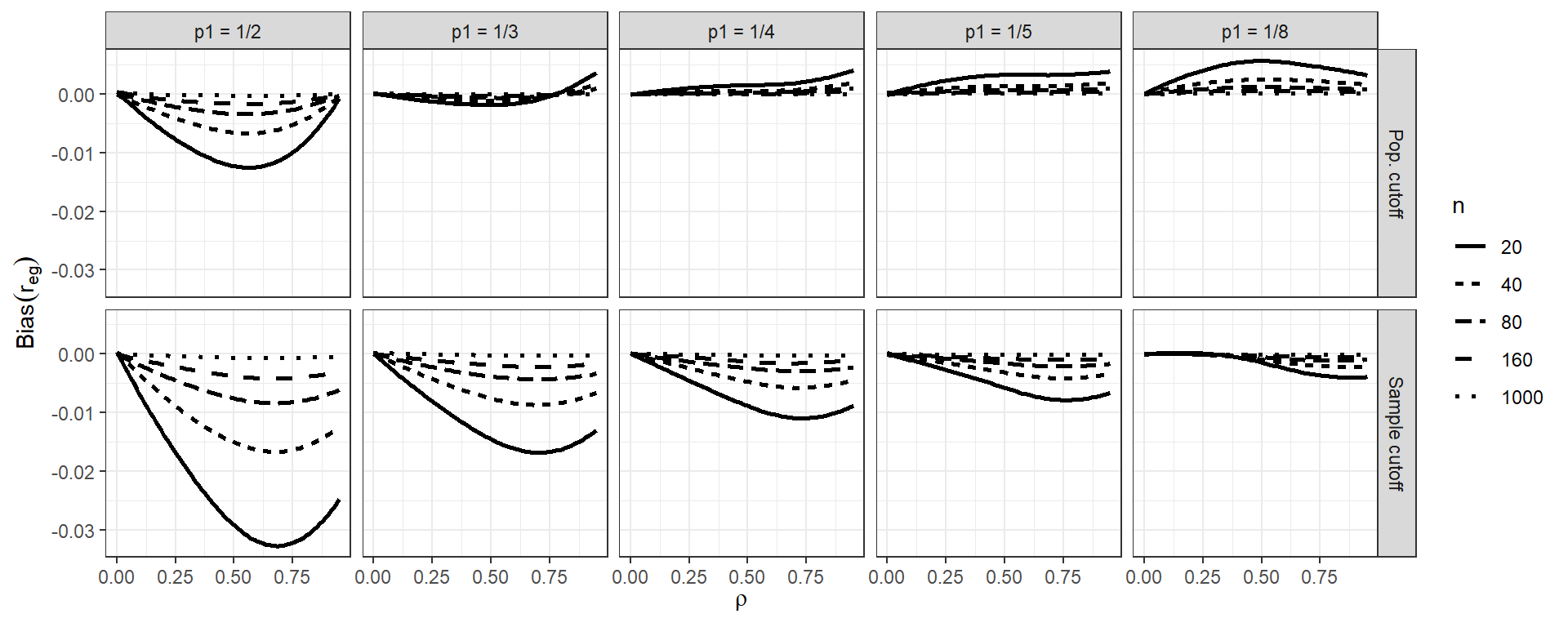
Source: Pustejovsky, J. E. (2014). Converting from d to r to z when the design uses extreme groups, dichotomization, or experimental control. Psychological Methods, 19(1), 92-112.
Note that in our figure, we have smoothed the lines with respect to rho using geom_smooth().
This is a nice tool for taking some of the simulation jitter out of an analysis to show overall trends more directly.
14.2.2 Example 2: Variance estimation and Meta-regression
In this example, we explore Type-I error rates of small-sample corrected F-tests based on cluster-robust variance estimation in meta-regression. The simulation aimed to compare 5 different small-sample corrections.
This was a complex experimental design, varying several factors:
- sample size ($m$)
- dimension of hypothesis ($q$)
- covariates tested
- degree of model mis-specification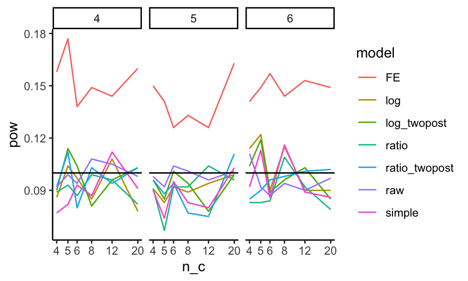
Here the boxplot shows the Type-I error rates for the different small-sample corrections across the covariates tested and degree of model misspecification. We add a line at the target 0.05 rejection rate to ease comparison. The reach of the boxes shows how some methods are more or less vulnerable to different types of misspecification. Other estimators are clearly hyper-conservitive, with very low rejection rates.
Source: Tipton, E., & Pustejovsky, J. E. (2015). Small-sample adjustments for tests of moderators and model fit using robust variance estimation in meta-regression. Journal of Educational and Behavioral Statistics, 40(6), 604-634.
14.2.3 Example: Heat maps of coverage
The visualization below shows the coverage of parametric bootstrap confidence intervals for momentary time sampling data In this simulation study the authors were comparing maximum likelihood estimators to posterior mode (penalized likelihood) estimators of prevalence. We have a 2-dimensional parameter space of prevalence (19 levels) by incidence (10 levels). We also have 15 levels of sample size.
One option here is to use a heat map, showing the combinations of prevelance and incidence as a grid for each sample size level. We break coverage into ranges of interest, with green being “good” (near 95%) and yellow being “close” (92.5% or above). For this to work, we need our MCSE to be small enough that our coverage is estimated precisely enough to show structure.
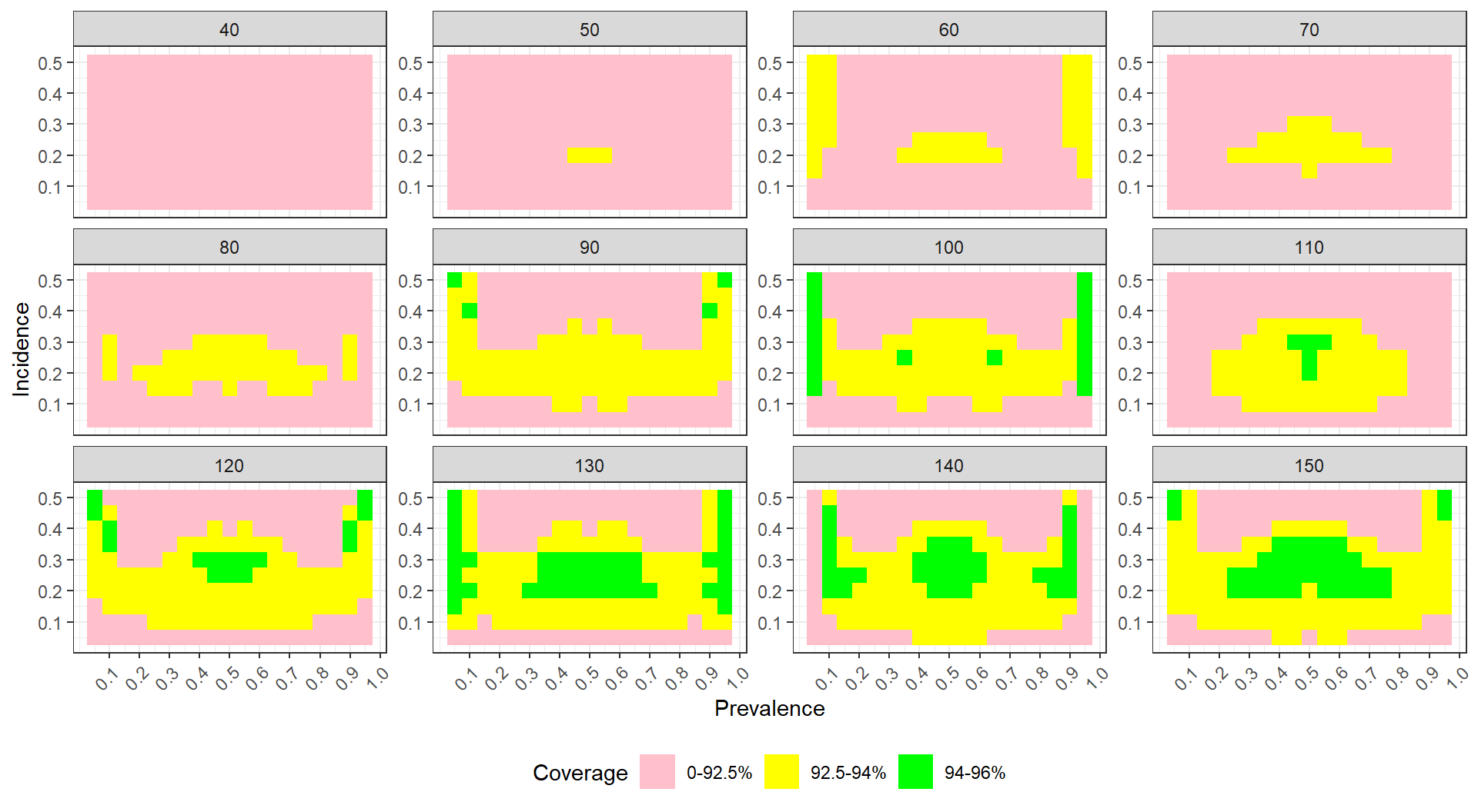
To see this plot IRL, see Pustejovsky, J. E., & Swan, D. M. (2015). Four methods for analyzing partial interval recording data, with application to single-case research. Multivariate Behavioral Research, 50(3), 365-380.
14.3 Modeling
Simulations are designed experiments, often with a full factorial structure. We can therefore leverage classic means for analyzing such full factorial experiments. In particular, we can use regression to summarize how a performance measure varies as a function of the different experimental factors.
First, in the language of a full factor experiment, we might be interested in the “main effects” and the “interaction effects.” A main effect is whether, averaging across the other factors in our experiment, a factor of interest systematically impacts performance. When we look at a main effect, the other factors help ensure our main effect is generalizable: if we see a trend when we average over the other varying aspects, then we can state that our finding is relevant across the host of simulation contexts explored, rather than being an idioscynratic aspect of a specific scenario.
For example, consider the bias of the biserial correlation estimates from above. Visually, we see that several factors appear to impact bias, but we might want to get a sense of how much. In particular, does the population vs sample cutoff option matter, on average, for bias, across all the simulation factors considered? We can fit a regression model to see:
options(scipen = 5)
mod = lm( bias ~ fixed + rho + I(rho^2) + p1 + n, data = r_F)
summary(mod, digits=2)
##
## Call:
## lm(formula = bias ~ fixed + rho + I(rho^2) + p1 + n, data = r_F)
##
## Residuals:
## Min 1Q Median 3Q
## -0.0215935 -0.0013608 0.0003823 0.0015677
## Max
## 0.0081802
##
## Coefficients:
## Estimate Std. Error
## (Intercept) 0.00218473 0.00015107
## fixedSample cutoff -0.00363520 0.00009733
## rho -0.00942338 0.00069578
## I(rho^2) 0.00720857 0.00070868
## p1.L 0.00461700 0.00010882
## p1.Q -0.00160546 0.00010882
## p1.C 0.00081464 0.00010882
## p1^4 -0.00011190 0.00010882
## n.L 0.00362949 0.00010882
## n.Q -0.00103981 0.00010882
## n.C 0.00027941 0.00010882
## n^4 0.00001976 0.00010882
## t value Pr(>|t|)
## (Intercept) 14.462 < 2e-16 ***
## fixedSample cutoff -37.347 < 2e-16 ***
## rho -13.544 < 2e-16 ***
## I(rho^2) 10.172 < 2e-16 ***
## p1.L 42.426 < 2e-16 ***
## p1.Q -14.753 < 2e-16 ***
## p1.C 7.486 8.41e-14 ***
## p1^4 -1.028 0.3039
## n.L 33.352 < 2e-16 ***
## n.Q -9.555 < 2e-16 ***
## n.C 2.568 0.0103 *
## n^4 0.182 0.8559
## ---
## Signif. codes:
## 0 '***' 0.001 '**' 0.01 '*' 0.05 '.' 0.1 ' ' 1
##
## Residual standard error: 0.003372 on 4788 degrees of freedom
## Multiple R-squared: 0.5107, Adjusted R-squared: 0.5096
## F-statistic: 454.4 on 11 and 4788 DF, p-value: < 2.2e-16The above printout gives main effects for each factor, averaged across other factors.
Because p1 and n are ordered factors, the lm() command automatically generates linear, quadradic, cubic and fourth order contrasts for them.
We see that, averaged across the other contexts, the sample cutoff is around 0.004 lower than population.
We next extend this modeling approach with two additional tools:
- ANOVA, which can be useful for understanding major sources of variation in simulation results (e.g., identifying which factors have negligible/minor influence on the bias of an estimator).
- Smoothing (e.g., local linear regression) over continuous factors to simplify the interpretation of complex relationships.
For ANOVA, we use aov() to fit an analysis of variance model:
##                  Df   Sum Sq  Mean Sq  F value
## rho               1 0.002444 0.002444  1673.25
## p1                4 0.023588 0.005897  4036.41
## fixed             1 0.015858 0.015858 10854.52
## n                 4 0.013760 0.003440  2354.60
## rho:p1            4 0.001722 0.000431   294.71
## rho:fixed         1 0.003440 0.003440  2354.69
## p1:fixed          4 0.001683 0.000421   287.98
## rho:n             4 0.002000 0.000500   342.31
## p1:n             16 0.019810 0.001238   847.51
## fixed:n           4 0.013359 0.003340  2285.97
## rho:p1:fixed      4 0.000473 0.000118    80.87
## rho:p1:n         16 0.001470 0.000092    62.91
## rho:fixed:n       4 0.002929 0.000732   501.23
## p1:fixed:n       16 0.001429 0.000089    61.12
## rho:p1:fixed:n   16 0.000429 0.000027    18.36
## Residuals      4700 0.006866 0.000001
##                Pr(>F)
## rho            <2e-16 ***
## p1             <2e-16 ***
## fixed          <2e-16 ***
## n              <2e-16 ***
## rho:p1         <2e-16 ***
## rho:fixed      <2e-16 ***
## p1:fixed       <2e-16 ***
## rho:n          <2e-16 ***
## p1:n           <2e-16 ***
## fixed:n        <2e-16 ***
## rho:p1:fixed   <2e-16 ***
## rho:p1:n       <2e-16 ***
## rho:fixed:n    <2e-16 ***
## p1:fixed:n     <2e-16 ***
## rho:p1:fixed:n <2e-16 ***
## Residuals
## ---
## Signif. codes:
## 0 '***' 0.001 '**' 0.01 '*' 0.05 '.' 0.1 ' ' 1
The advantage here is the multiple levels of some of the factors get bundled together in our table of results. We can summarise our anova table to see the contribution of the various factors and interactions:
##                     eta.sq eta.sq.part
## rho            0.021971037  0.26254289
## p1             0.212004203  0.77453319
## fixed          0.142527898  0.69783705
## n              0.123670355  0.66710072
## rho:p1         0.015479114  0.20052330
## rho:fixed      0.030918819  0.33377652
## p1:fixed       0.015125570  0.19684488
## rho:n          0.017979185  0.22560369
## p1:n           0.178055588  0.74260975
## fixed:n        0.120065971  0.66049991
## rho:p1:fixed   0.004247472  0.06439275
## rho:p1:n       0.013216569  0.17638308
## rho:fixed:n    0.026326074  0.29902214
## p1:fixed:n     0.012839790  0.17222072
## rho:p1:fixed:n 0.003857877  0.05883389
Here we see which factors are explaining the most variation. E.g., p1 is explaining 21% of the variation in bias across simulations.
The contribution of the three way interactions is fairly minimal, by comparison, and could be dropped to simplify our model.